E.L.Nemirovsky
“...The new work on the book has not yet gone so far as to explode the traditional form of the book. Despite the crises that book production is experiencing along with other types of products, the book glacier is growing every year. The book has turned into a monumental work of art, it is not only caressed by the gentle fingers of a few bibliophiles, it is grasped by hundreds of thousands of hands.” This statement is unusually modern, yet it is taken from the article “Our Book,” published in the pages of the Gutenberg Yearbook about 80 years ago. Its author, Lazar (Eliazar) Markovich Lissitzky, or, as he usually signed his works, El Lissitzky, had a tremendous influence on the development of book art in the twentieth century.
Lazar Lisitsky was born on November 10, 1890 in the small town of Pochinok, lost among the forests of the Smolensk province. He became a Russian by pure chance. His father, Mark Lissitzky, went to seek his fortune in distant America, succeeded there and wrote to his wife asking her and two-year-old Lazar to come to him. But the mother of the future artist, a devout Jew, decided that first she needed to consult a rabbi. The wise rabbi said that one should not leave the land where the graves of grandfathers and fathers are located. As a result, the aspiring American entrepreneur Mark Lissitsky returned to Russia, because he could not imagine life away from his beloved wife and son, on whom he had high hopes.
Soon the family moved to Vitebsk. And little Lazar was sent to study in the provincial Smolensk, where his grandfather had a small hat workshop. The boy learned the basics of science at the Smolensk real gymnasium, and spent his holidays at home. Here he attended the school-workshop of the artist Yudol Pan (1854-1937), a graduate of the St. Petersburg Academy of Arts. Young Lazar's passion for drawing was still unconscious, but quite definite. Peng was a good realist, but, oddly enough, his students, of whom Marc Chagall (1887-1985) became the most famous, became the founders of all sorts of “isms” that are so characteristic of the 20th century.
After graduating from high school, Lazar Lisitsky decided to follow the path of his Vitebsk teacher and went to St. Petersburg to enter the Academy of Arts. But he was not accepted. Then the young man went to Germany to Darmstadt, where he became a student at the Faculty of Architecture of the Polytechnic Higher School. In the summer of 1911, he visited the Mecca of artists, Paris, where he was invited by Ossip Zadkine (1890-1967), another native of Vitebsk, who became a famous French artist. The following summer, 1912, Lissitzky traveled around Italy. He painted a lot, mainly landscapes; his works with views of Pisa and Ravenna have survived. Carefree pre-war Europe generously opened up the cultural values accumulated over centuries to the young artist.

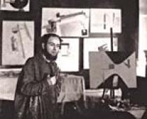
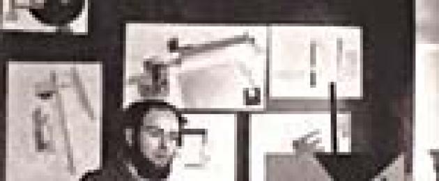
El Lissitzky. From a photograph from 1919
The newly minted architect received his diploma just before the outbreak of the First World War, and in 1914 he had to flee Germany and, with great difficulty, through Switzerland, Italy, Serbia, get to Russia. The young man settled in Moscow, where he became an assistant to the architect Roman Ivanovich Klein (1849-1925), who built the neoclassical Museum of Fine Arts (now the State Museum of Fine Arts named after A.S. Pushkin) opposite the Cathedral of Christ the Savior, contrasting with its Byzantine luxury. At the same time, Lisitsky first took up book graphics; he made the cover for the poetry collection “The Sun is Declining” by Konstantin Aristarkhovich Bolshakov (1895-1938), which was published in Moscow in 1916. This was the second collection by an author who was associated with the futurists. K. A. Bolshakov did not become a great poet; during the Civil War, he fought in the Red Army, and then wrote novels and historical and biographical stories. Lissitzky's work for Bolshakov's collection was eclectic in many ways, but his very next graphic experiments attracted the attention of book experts.

Case of “The Prague Legend” by M. Broderzon
In the spring of 1917, the Moscow publishing house "Shamir" published an unusual book "The Prague Legend", a collection of poems by M. Broderson (1890-1956). These poems were written in Yiddish, a largely artificial language that snobs contemptuously called jargon, but which was spoken by a large Jewish population in Russia, Poland, and Romania at that time. M. Broderson was young and was strongly influenced by the futurists. Subsequently, he would work in drama and journalism, and during the war years he would write the poem “The Jews,” which was called an indictment against Hitlerism.

M. Broderson. Prague legend. M., 1917. Copy with hand coloring by El Lissitzky
The circulation of The Prague Legend was small - only 110 copies. The text reproduced by lithographic method was not typed, but handwritten by a master calligrapher. Lissitzky painted 20 copies by hand. They were made in the form of a scroll, which, like the Torah (as Jews call the Pentateuch of Moses - the initial part of the Bible), was enclosed in a wooden coffin box. Lazar Lissitzky decorated the pages of the scroll with watercolor drawings and patterned ornamental frames. The delightful colors were a delight to the eye. The book was distributed to bibliophile collections. Today, one of the copies of this rare publication is kept in the Book Museum of the Russian State Library. The second can be seen in the State Tretyakov Gallery.

El Lissitzky. Drawing from “The Tale of the Goat” (Kyiv, 1917)
The traditions of small-town Jewish folklore form the basis of another work by Lazar Lisitsky, “Tales of the Goat,” published in 1919 in Kyiv. 75 copies of this book were illustrated with color lithographs. The text of the tale echoes the legend “Rabbi of Bacherach” recorded by the German poet Heinrich Heine (1797-1856). This allowed the Berlin publishing house Der Morgen to reproduce facsimile copies of the Russian artist's lithographs in a new edition of the legend, published in 1978.

El Lissitzky. Leaf from the album "PROUN". 1919
A turning point in the life of Lazar Lissitzky came in May 1919, when, at the invitation of Marc Chagall, who headed the People's Art School in Vitebsk, he moved to his native Belarusian city, where he headed the architectural department and the graphics and printing workshop.
Today it is customary to scold the October Revolution, pejoratively calling it the Bolshevik coup. There are no words, the revolution led to the suffering of many innocent people. But at the same time, it contributed to a powerful cultural upsurge, the awakening of dormant cultural forces in the province, which made a significant contribution to the formation of new literature and art. In the article by Lazar Markovich Lisitsky, an excerpt from which we quoted at the beginning of the article, there are the following lines: “During the revolution, hidden energy accumulated in our young generation of artists, which was only waiting for a big order from the people in order to reveal itself. The audience was a huge mass, a mass of semi-literate people. The revolution did a colossal educational and propaganda job in our country. The traditional book was torn into individual pages, enlarged a hundred times, enhanced by color printing, and taken out onto the street as a poster."
In the history of fine art in the first post-revolutionary years, Vitebsk played approximately the same role as Odessa in the field of fiction. It was a school of talents in which young people gathered under the wing of Marc Chagall who sought to explode traditional forms. The names of Kazimir Malevich, Lazar Lisitsky, Robert Falk, Solomon Yudovin, who were raised here, are no less famous in the history of Russian culture than the names of Odessa residents Eduard Bagritsky, Konstantin Paustovsky, Valentin Kataev, Isaac Babel, Vera Inber, Evgeny Petrov and Ilya Ilf.
There was a Civil War in the country. Lazar Lissitzky's sympathies were on the side of the revolution, with which he inextricably linked the formation and further development of new art. The artist also took part in the agitation and propaganda work launched by the authorities. At that time, it was largely in the hands of enthusiasts and romantics, who had no idea that they would soon begin to destroy each other. In this regard, it is worth noting the poster “Beat the Whites with a Red Wedge” made by Lissitzky in 1919. His graphic design reveals the features of a movement that later became known as constructivism.

El Lissitzky. Poster "Beat the whites with a red wedge." 1919
Together with Kazimir Malevich, Lissitzky organized art workshops in Vitebsk, which in the newspeak of the revolution were called UNOVIS, which meant “Approval of the New in Art.” The manifesto of the commonwealth was the brochure “Suprematism” by K. Malevich, published in Vitebsk in 1920. It was small: four pages of handwritten text, reproduced in lithography, and 34 black and white lithographs. In 1977, at an auction in New York, this book was valued at $22,500.
The almanac “UNOVIS”, illustrated with lithographs, was published in a circulation of seven typewritten copies, on the pages of which Lissitzky published the articles “Suprematism of Creation” and “Suprematism of World Construction”. The ideas of Kazimir Malevich had a decisive influence on the formation of the creative personality of Lazar Lissitzky.

I. G. Erenburg. 6 stories about easy endings. M.; Berlin, 1922. Cover by El Lissitzky
The album “PROUN” was also conceived in Vitebsk, the name of which stands for “Project for the Approval of the New,” which was published in Moscow, where Lissitzky returned at the beginning of 1921. Eleven lithographs in it were preceded by the “Declaration”. Some lithographs had titles “City”, “Bridge”, while others were indicated only by numbers. The circulation of the almanac was 50 copies. There was something cosmic in Suprematist constructions. “We are now experiencing an exceptional era of the entry into our consciousness of a new birth in space,” the artist wrote.
At the end of 1921, Lissitzky went on a business trip to Germany to Berlin. This city at that time was the center of cultural life, both emigrant, oppositional to the established regime in Russia, and sympathetic to it. Russian publishing houses worked there, magazines were published, and exhibitions were held. Russian intellectuals gathered at the Nollendorfplatz cafe, where on Fridays they held a kind of public reading. Alexei Nikolaevich Tolstoy, Sergei Yesenin with Isadora Duncan, Andrei Bely, Boris Pasternak, Viktor Shklovsky were here... Lisitsky met the young poet Ilya Grigorievich Erenburg (1891-1967) here. The first novel that made him famous, “The Extraordinary Adventures of Julio Jurenito and His Students,” had not yet been published. Together with Ehrenburg, Lissitzky began publishing the magazine “Thing,” which they opened with a joint declaration. On its cover the title was given in Russian, German and French, and some articles were published in the magazine in a similar way. The magazine did not last long: the first double issue was published at the beginning of 1922, the next one in May; Unfortunately, there was no continuation. “The Thing,” Ehrenburg later said, was published by the Scythians publishing house. It is easy to guess how far the revolutionary Slavophiles and incorrigible populists were from the ideas of constructivism that we preached. After the first issue, they could not stand it and dissociated themselves from us in print.” But the magazine was conceived on a grand scale. The first 32-page issue had six sections: art and society, literature, painting, sculpture, architecture, theater and circus, music, cinema. The “Literature” section published poems by Vladimir Mayakovsky, Sergei Yesenin, Boris Pasternak, Nikolai Aseev, French and German poets. In 1976, the magazine "Thing" was translated into English and published with detailed comments.

The front page of the magazine "Thing"
In the same 1922, Lissitzky also made the cover for the book “6 Stories about Easy Endings” by Ilya Ehrenburg, published in Berlin by the Helikon publishing house. Two colors dominated here: black and red, contrasting, but surprisingly harmonizing with each other. Such a decision became the main one for Lissitzky for several years; it was as if other colors did not exist for him. Whether Lissitzky knew about this or not, he followed a long-standing national tradition: in an old printed Russian book in the Kirill font, only these two colors were also used.

El Lissitzky. Cover of the magazine “Thing”
Lissitzky maintained friendly relations with Ehrenburg until the end of his days. Subsequently, already at the end of his life, Ilya Grigorievich recalled: “Lissitsky firmly believed in constructivism. In life he was gentle, extremely kind, sometimes naive, he was ill, he fell in love, as people fell in love in the last century, blindly, selflessly. And in art, he seemed to be an adamant mathematician, inspired by precision, and raved about sobriety. He was an extraordinary inventor, he knew how to design a stand at an exhibition in such a way that the poverty of the exhibits seemed excessive; knew how to construct a book in a new way.”
Lissitzky's great love was Sophie Küppers, a recently widowed woman with two small children, the owner of an art gallery in Hanover. It is difficult to say why the young, beautiful and rich German woman was attracted to the frail, half-poor and, moreover, sick (Lissitzky had tuberculosis) Jew. Sophie followed Lissitzky to the Soviet Union, tasted all the delights of the Stalinist regime here, was exiled to Siberia during the war years and died in Novosibirsk on December 10, 1978, having outlived her second husband by 37 years.
But let's return to Germany in the early 20s. The finest hour struck for Lazar Lissitzky in 1922-1923, when two of his books were published in Berlin: “A Suprematist Tale about Two Squares” and “For the Voice” by V.V. Mayakovsky. Lazar Markovich designed many books, but he considered these two to be the main ones for himself; he named them when answering the corresponding question in a questionnaire in one of the German encyclopedias on February 25, 1925.
“Skaz” was “built” back in 1920 in Vitebsk. It was published by the Berlin publishing house "Scythians". The activities of this publishing house, founded by E. G. Lundberg, did not last long - from 1920 to 1925. The book was printed in the printing house of E. Haberland in Leipzig.


El Lissitzky. Spreads of the collection “Mayakovsky for Voice”. 1922
“A Suprematist Tale of Two Squares” is a 10-page brochure addressed to “everyone, all the guys.” There is almost no text in it. The plot, quite transparent, but far from immediately perceivable, unfolds in pictures. Two squares black and red from deep space fly to Earth. Here they see the dominance of black and “anxious.” Strike the black and harmony is established. Red buildings are erected on black soil. The subtext is a story about the eternal struggle between good and evil, as well as a premonition of the great upheavals that the 20th century was preparing for humanity. For Lissitzky, what was most important was the play of shapes and colors, to which everything was subordinated. The design of “Skaz” was far from politics, because in it red opposed not white, but black.
The little book was a success and in the same 1922 it was republished in The Hague (Netherlands). Its cinematography, so to speak, immediately caught the eye. “The Tale” was even going to be filmed, but this idea, unfortunately, was not realized.
For the collection “For the Voice” V.V. Mayakovsky selected 13 poems. The Moscow State Publishing House, which before the NEP was proclaimed in 1921 had almost a monopoly on the book market, did not like the collection. It wasn’t that it was banned, but it was clearly not recommended for publication. It was then that the idea came to release the collection in Berlin. The representative of the People's Commissariat for Education and the State Publishing House in Berlin, which was under its jurisdiction, Zinovy Grigorievich Grinberg, helped in this. With his blessing, the stamp “R.S.F.S.R.” appeared on one of the first pages of the book. State publishing house. Berlin 1923". Moscow did not give permission for this.
In fact, it must be said that V.V. Mayakovsky did not experience any difficulties with the publication of his books, although Vladimir Ilyich Lenin, brought up on the Russian classics of the 19th century, once publicly said that he was not one of the fans of his work. But he immediately admitted his incompetence in this area. In 1923 alone, 15 collections of Mayakovsky's poems were published. Among them is a unique two-volume collection of works, “13 Years of Work.”
“Well-wishers” immediately reported to Moscow about Z.G. Grinberg’s decision. The authorities immediately gave him the appropriate reprimand. On June 23, 1923, the head of the State Publishing House Nikolai Leonidovich Meshcheryakov (1865-1942) wrote to Greenberg:
“According to the information we have received, in Berlin, in accordance with your order, the printing of V.V. Mayakovsky’s book “Mayakovsky for Voice” is currently being completed, indicating on the cover: State Publishing House, Berlin.
If this information is completely true, then, although for commercial reasons we do not find it possible to make changes to the finished publication, delay its publication and sale, we nevertheless point out to you that it is completely inadmissible for you to give orders for publications without the sanction of their editor Gosizdat, because the editorial board of Gosizdat bears ideological responsibility for all Gosizdat publications before the party and the Soviet government.
At the same time, we bring to your attention that, in accordance with the resolution of the Administrative Commission of the State Publishing House dated 21 this month, you personally bear full responsibility for all misunderstandings of both a commercial and legal nature that may arise in connection with the above-mentioned publication of V.’s book. V. Mayakovsky ".

El Lissitzky. Cover of the collection “Mayakovsky for Voice”. 1922
Z.G. Grinberg asked permission to print the book after the fact, but did not receive a response from Moscow. The case was not completed more than a year later. On November 22, 1924, Greenberg wrote to Moscow: “... the third question concerns the detention here of Mayakovsky’s book “For the Voice.” As you probably know from my letter, Mayakovsky published a collection of his poems “Mayakovsky for Voice” here. At the request of the author, considering his book not harmful to Gosizdat as an author with a large circle of readers, I purchased 2000 copies here. and gave the corresponding order to the book publishing department dated 15/XI 22. The book publishing department put a publishing stamp on the book without asking for my consent. To my inquiry about whether this book should be sent to Gosizdat, the latter did not give me any answer. The book is still here today. Bringing to your attention the above, I kindly ask you to tell me what to do with Mayakovsky’s book in the amount of 1000 copies. One thousand copies. Mayakovsky took with him for transfer to Gosizdat."
So, we learn that the book publishing department of the Berlin trade mission allegedly, without Greenberg’s knowledge, stamped the book with the stamp of the State Publishing House. This department at that time was headed by Ivan Pavlovich Ladyzhnikov. In his handwritten memoirs, stored in the V.V. Mayakovsky Museum, there is a short mention of the book “For the Voice”: “In Germany, V.V. Mayakovsky set out to publish a book. The fact is that it was difficult to publish in Moscow at that time; there was no paper. I was in charge of the publishing department of the trade mission in Berlin and tried to help in the publication of his volume of poetry. He was fascinated by the appearance and shape. Someone inspired him to get in shape, it seems Lissitzky. There was little original in the form, but if a person likes it, why not do it, not help. And I helped in every possible way.” Ladyzhnikov, as we see, was skeptical about the concept of book design developed by Lissitzky. Let's talk about the solution proposed by the artist to see how wrong the trade mission official was.
Lissitzky designed the book like a telephone directory with a ladder-like register that allows you to quickly find the poem you need. On the cutouts of the register there are abbreviated names of the poems: “March”, “Kuma”, “Love”, “Sun”, as well as symbolic two-color drawings made up of rectangles and circles. As in “The Tale,” this book uses only two colors (except for the white color of the paper) black and red. Their struggle, turning into cooperation, continues.
The register gave the book a volume that you immediately feel when you pick it up. In this regard, the art critic Yuri Yakovlevich Gerchuk wrote about the “dynamics of the book”: “The table of contents-register,” he argued, “organizes many “entrances” into the book and gives quick access to the beginning of each poem.”
The collection “For the Voice” was published by a small Berlin printing house “Lutze und Vogt” (“Lutze & Vogt G.m.b.H.”). The book was published in January 1923. It was “dressed” in a binding made of soft cardboard, painted orange. The book is preceded by an loose title page with a hand-drawn composition and typesetting red text. This is the only sheet of the book printed from a halftone plate. As a frontispiece, a composition in the form of a circle was used, inside which were placed a triangle, a circle, a square and the letters L Y B. These are the initials of V.V. Mayakovsky’s beloved Lily Yuryevna Brik. If you read this inscription counterclockwise, it reads “LOVE.” Thus, the frontispiece is also a dedication.
The circulation in the publication is not indicated. From the above letter from Z.G. Grinberg it is known that he purchased 2000 copies and that 1000 of them were given to Mayakovsky, who took them to Russia. The poet liked the book, but, oddly enough, he mentioned it only once - in an interview given in 1924. He said the following: “The Berlin publishing house of the RSFSR published the book “Mayakovsky for Voice” (design by the artist Lissitzky), which is exceptional in the technique of performing graphic art.” The phrase is clumsy; one feels that these are not the words of Mayakovsky, but of the journalist who interviewed him.
El Lissitzky. Cover of the book “About 2 squares”. 1922
Lissitzky himself spoke about the history of the publication “For the Voice” in an interview he gave on February 19, 1939. “At the end of 1922,” he said, “we learned that Mayakovsky was flying to Berlin. This was typical for Mayakovsky - he always used the latest transport capabilities. Mayakovsky informed me that the State Publishing House was going to publish his book. For this purpose, a branch of the State Publishing House was created in Berlin. Mayakovsky invited me to take on the design of the book as graphics, while he would act as the author and Lilya Brik as the editor. We selected 13 poems. The book was intended for public reading. To help the reader quickly find the right poem, I came up with the idea of using the principle of register here. Vladimir Vladimirovich agreed with this. Usually our books were printed in large printing houses. Leading technical editor Scaponi found a small printing house for us. He said: “It is better to carry out this risky enterprise in a small establishment, where they will understand you faster.” The typesetter was German. He typed completely mechanically. For each page I made a special sketch for him. He thought we were a little touched. During the work, the management of the printing house and typesetters were fascinated by this unusual book and realized that its contents required original design. At their request, I translated poetry for them."
As we see, the circumstances of the publication of “For the Voice” are told by Lissitsky differently than in the correspondence of Z. Grinberg with N. Meshcheryakov. The artist forgot something a long time ago. For example, he called the technical editor of Gosizdat Bruno Georgievich Scamoni Scaponi.
"For the Voice" is not a rare book. In the Book Museum of the Russian State Library alone there are eight copies of it. Among them are those that belonged to the famous bibliophiles V.A. Desnitsky, A.K. Tarasenkov, N.P. Smirnov-Sokolsky. But it was not in the famous library of Russian poetry of Ivan Nikanorovich Rozanov.
I was lucky enough to purchase this book in August 1945 at a second-hand bookstore on what was then Soviet Square. I paid for it a symbolic amount for those times - 35 pre-reform rubles. Books in the first post-war years were incredibly cheap. At that time I was interested in Mayakovsky, but I had never heard anything about Lissitzky. And only many years later I discovered what a treasure I owned. The copy I bought was complete and clean. In the poem “The Story of How the Godfather Interpreted Wrangel,” the lines were even preserved in it:
The censors mercilessly erased these lines, and in subsequent editions they were completely thrown out.
To be continued.
This year marks the 120th anniversary of the birth of Vladimir Mayakovsky. In addition, book connoisseurs, designers, constructors and printers can celebrate another milestone: exactly 90 years ago the book “Mayakovsky for Voice”, created by El Lissitzky, was published. This book is still an unsurpassed standard of constructivism, as well as the most expressive experience in visualizing the poetic word.
"The printed sheet conquers space and time"
L. Lisitsky
During Vladimir Mayakovsky's lifetime, more than 100 books were published - a rare productivity and incredible publishing activity. At the same time, 1923 can be recognized as the year of highest achievements in Mayakovsky’s book publishing career: firstly, 19 of his books were published during the year (!), and secondly, nothing equal to the concept books “For the Voice” and “About This” ( designed, respectively, by Lissitzky and Rodchenko) did not appear again. In this article we will take a closer look at the first of them.
 Cover of MERZ magazine (1923, no. 4)
The cover of the book provokes an ambivalent reading of the title, because the author’s surname can be understood as an element of the title: “For the voice” vs. "Mayakovsky for voice." It can be argued that such a design technique is far from accidental, since when analyzing the titles of all Mayakovsky’s lifetime books, an important feature is revealed: 17 books are already title contain the author's surname (!). In addition, on a number of covers the surname “Mayakovsky” is not accompanied by either a name or initials - this also reveals a conscious element of a total life-building strategy, the transformation of one’s own name into a common noun (into a “brand”).
I'll make myself some black pants
(“Veil Jacket”, 1914)
I'm coming - beautiful,
twenty-two-year-old...
(“Cloud in Pants”, 1916), -
even reaching shocking and prophetic notes in the poem “Man” (1917). Over time, Mayakovsky’s voice began to be perceived by his contemporaries as a kind of mythologeme, while the poet himself did not stop singing his own voice even when the romantic impulse of the Revolution was left behind. It is significant that Mayakovsky’s poetic testament - a powerful clot of energy directed straight into the future “through the heads of poets and governments” - is called nothing less than “At the top of his voice”...
 Spreads from the book “For the Voice”
But let’s return to the collection “For the Voice.” In addition to what has already been said, this title further emphasizes the nature of the book’s design as a “score” - involuntarily anticipating Mayakovsky’s future music editions, with their subtitles “for voice and piano”, “for choir with piano”, etc. Lissitzky assembled illustrations from the elements typesetting cash register, printing is done in black and red paint; the cutting-out register with typesetting symbols for each poem gave the book volume, thing ity and a kind of “interactivity”. Like an architectural creation, the book is precisely “constructed,” as indicated on the title.
On the title page there is an anthropomorphic “figurine”-proun, a robotic character “Reader”, entirely borrowed from an album of lithographs released by Lissitzky in Hanover in the same 1923 based on the opera by A. Kruchenykh, M. Matyushin and K. Malevich “Victory over The Sun" (1913) - therefore, the geometric circle on the orange cover of the collection "For the Voice" is quite appropriate to be considered precisely as Sun, especially since one of the poems in the collection is nothing more than a conversation between Mayakovsky and the Sun.
 Figurine “Reader” on the title of the collection “For the Voice”
On the frontispiece there is another composition - in the form of an open ring with a triangle, a square and three letters: ideogram-dedication L Yu B- the initials of the poet’s beloved, looping into the infinite LOVE LOVE. It can be assumed that when constructing this frontispiece, Lissitzky was guided by the instructions of Mayakovsky himself, or took as a basis the equally significant frontispiece-ring for Mayakovsky’s collected works entitled “13 Years of Work,” which was published six months earlier (design by Anton Lavinsky).
But, I believe, El Lissitzky’s composition on the frontispiece of the book “For the Voice” can at the same time be read as a giant letter “ E" That is, this is nothing more than a monogram-initial of the artist himself ( E l). Let me remind you that the cover of the Berlin magazine “THING” (1922) designed by him can also be considered as a giant author’s monogram - this time in the form of the Latin letter “ L».
 Ideograms of L Yu B on the frontispieces of Mayakovsky’s books “For the Voice” and “13 Years of Work”
It is interesting that the principle of the register book was anticipated by Lissitzky a little earlier, on the cover he made for R. Ivanov-Razumnik’s book “Mayakovsky: “Mystery” or “Buff”” (Berlin, 1922), which plays on the vertical alphabet in the telephone book. This cover, entirely built on font, carries an obvious reference to Malevich’s black square, as well as a playful anagram - the name of the publishing house unexpectedly “appears” in the surname of the book’s hero: SKI fy ↔ lighthouses SKI y.
In the next decade, Lissitzky used the register principle as a constructive and design technique more than once - when designing book and magazine covers, catalogs, and guidebooks.
Lissitzky’s cover for the collection “For the Voice” was borrowed a year later by Nikolai Ilyin when designing the second issue of the Nizhny Novgorod magazine “Workers’ Creativity” for 1924. However, it is difficult to find an appropriate definition here - is it borrowing, variation, imitation, or is it a pastiche and an intra-shop gesture that openly appropriates the master’s achievement, or is it banal plagiarism. It must be said that plagiarism was by no means uncommon in those years; according to the authoritative judgment of V. Krichevsky, “plagiarism was looked at as the introduction of worthy examples into life.” I note that later Ilyin became the author of two covers of Mayakovsky’s lifetime books, in which the direct influence of Lissitzky is felt [. But now let’s compare the cover of “For the Voice” and the cover of “Working Creativity”.
 Cover by Lissitzky for the book “Mayakovsky: “Mystery” or “Buff”? (1922); "For the voice"; Cover by N. Ilyin for the magazine “Workers' Creativity” (1924)
First of all, we see that for his cover Ilyin chose printing in the same two colors - red and black. Large capital letters from printing dies and a completely identical “sun” circle (bottom right) duplicate Lissitzky’s composition. The dynamic two-color lines added by Ilyin are echoes/imitation of Lissitzky’s Suprematist constructions, which have lost all their ideological charge and here turned into excessive decoration. There is a special copy of the cover, printed (which is important!) on the same orange cardboard as Lissitzky’s cover.
In 1927, an article by Sophie Küppers, Lissitzky’s wife, appeared in the magazine “Printing Production” with a review of exhibits from the production graphics department at the All-Union Printing Exhibition in Moscow. She dwelled in most detail on the collection “For the Voice”, the work on the design of which is interpreted, in fact, as a manifesto:
“The most conscious work on typesetting material and the book as a whole was carried out a number of years ago by Lissitzky, who was fascinated by the capabilities of high-quality foreign machine technology. His book of Mayakovsky's poems is the first attempt to create an architectural complex from the cover, register, individual pages and poetic content. All the elements of printing, the size of the letters, their relationships and proportions, the size of the pages, the ratio of the surface filled with printing to the clean one, color intersections, all the possibilities that the typesetting box provides, are used here and merged into a single whole, giving a new face to the book. It is these political poems, these stimulating appeals to the masses that cannot be typographically designed otherwise than through clearly and sharply acting letters and numbers, which are concentrated into optical signs corresponding to the sound content of the verse. Each poem remains in the memory like a brand name..."
It remains to say that another evidence of the furore that the book “For the Voice” made in the world of book designers and typographers, in my opinion, is one of Kirill Zdanevich’s illustrations for the book “Every page is an elephant, sometimes a lioness”, published in Tiflis "(1928). The opening lines “I am showing the Lion, / look, / here / he is not at all the king of beasts / just the chairman,” Zdanevich accompanied with a hand-drawn portrait of the author himself (in a characteristic jacket, vest and tie), and in his left hand the declaiming Mayakovsky holds nothing more than “ For Lissitzky's voice...
 Kirill Zdanevich. Mayakovsky with the book “For the Voice” in his hands (illustration from the book “Every page is either an elephant or a lioness”; 1928)
Only one opinion of Mayakovsky about this magnificent book has been preserved, recorded in the retelling of a journalist from Odessa Izvestia (issue dated February 21, 1924): “The Berlin publishing house of the RSFSR published the book “Mayakovsky for the Voice” (design by the artist Lissitzky), which is exceptional in the technique of performing graphic art."
“Photographs of the book were published in various newspapers in Germany and France... A special evening was dedicated to the book “For the Voice” in the Nollendorfplatz cafe. The speaker was Viktor Shklovsky. It was a bit stormy. Characteristic of the atmosphere of this “Friday,” as I recall, was the speech of Andrei Bely, who criticized “The Thing” and called me and Ehrenburg “larvae of the Antichrist.” White Guard newspapers, such as the Berlin Rul, foamed at the mouth, criticized the book, while moderate publications gave a positive assessment. Thus, the Parisian "Last News" wrote: "The book published by Mayakovsky in Berlin ("For the Voice") is still very good, this cannot be denied in any way: talented, sarcastic."
Mayakovsky himself brought part of the edition of “For the Voice” to his homeland. The book was of little interest to the leadership of the State Publishing House, which condescendingly considered it “not harmful.” Having been published in January 1923, the main edition lay idle in Germany at least until December 1924, after which it was finally exported and sold in the USSR. The fact that “For the Voice” appears on GIZ advertisements at least until the end of 1927 allows us to conclude that with a circulation of three thousand (and at a price of 1 ruble 50 kopecks), even four years after its publication, this book masterpiece is still hasn't sold out yet. Much later, the book was repeatedly reproduced in facsimile and even its reprints, not to mention the originals, are the pearls of any book collection.
 Newest Dutch reissue of the collection “For the Voice” (Amsterdam, 2012)
About the second book, the poem “About This,” see: Lavrentyev A. N. Alexander Rodchenko. M., 2011. pp. 206–207; Rossomakhin A. Mayakovsky and Rodchenko: “About this” // Projector. 2012. No. 2 (19). pp. 98–101.
1. Words printed on a sheet of paper are perceived by the eyes, not by hearing.
The first of the eight principles of typography outlined by Lissitzky in "Topography of Typography" in 1923. The term typography itself was also coined by Lissitzky. In the same year, a book of Mayakovsky’s poems “For the Voice” was published, designed by Lissitzky. Mayakovsky himself commissioned him to design the book; according to his plan, it was intended to be regularly taken out of trouser legs for public reading. To make it easier to find a specific poem, Lissitzky designed the book like a telephone directory, cutting out a ladder along the edge of the page. Do you understand why the book has this title? :) Lissitzky wanted to achieve unity between the poem and typographic elements and achieved it, and for the design of this book he received an honorary invitation to become a member of the Gutenberg Society.
Pictures were blatantly stolen from the diary babs71
. You can also admire all the other pages from him.
I'm ashamed, but these are the most correct pictures I found. You can see the “volume” that these pages are so cleverly cut out, and not just inscriptions printed along the edges.
The most famous work of El Lissitzky. A plan of attack, a call to action, and an icon of Suprematist printing.
A visual illustration of the third principle "Economy of perception - optics instead of phonetics." The poster was made in 1920 for the Political Directorate of the Western Front.
And in the 80s it was photoshopped :)
"A Tale of Two Squares", 1922. Book for children. Again, minimum means and maximum expressiveness. I would not have liked this book as a child. Lissitzky wanted to somehow combine them, he intended to use a movie camera, something like a cartoon, it’s a pity that they haven’t done anything like this in the Soviet Union yet. But the man who dreamed of a continuous sequence of pages, bioscopic books and foresaw the emergence electric libraries, clearly understood what a super cartoon this could be.
In 1922, together with I. G. Ehrenburg, he published the magazine “Thing”
(in Russian, French, German).
Lithograph from the album "Victory over the Sun. Electromechanical Show", 1923.
"New Man"
Project of horizontal skyscrapers in Moscow. 1923 Lissitsky proposed building several such skyscrapers at the intersection points of radial streets with the Boulevard Ring. To save space and time. One of the supports sank below the surface to the crossing of the metro lines and served as an exit from the station. Tram stops were planned near the other two. Various institutions would be located on top.
Poster of the first Soviet exhibition in Switzerland.
Cover of the prospectus of the Soviet department of the International Hygiene Exhibition in Dresden.
Cover of the catalog of the Soviet pavilion at the International Printing Fair "Press" in Cologne in 1928.
Children's book "4 actions". Was not published.
El Lissitzky died in December 1941.
A few days before his death, his poster was printed in thousands of copies.
“Let's have more tanks... All for the front! Everything for victory!
Self-portrait. Photomontage. 1924 El seems to mean “god” in Hebrew, hence the compass.
El Lissitzky is an iconic figure of the Russian avant-garde, architect, artist, designer, first Russian graphic designer, master of photomontage, engineer. A supporter of Suprematism actively worked to transition this trend into the field of architecture, and his projects were several decades ahead of their time.
Architect against his will
Lazar Lisitsky was born on November 22, 1890 in the small village of Pochinok, Smolensk region, into a Jewish family. His father was an artisan entrepreneur, his mother a housewife. The family moved to Smolensk, where Lazar graduated from the Alexander Real School. Later they moved to Vitebsk, where the boy became interested in painting and began taking drawing lessons from the local artist Yudel Pan. By the way, he was also Marc Chagall’s teacher. In 1909, Lissitzky tried to enter the Art Academy in St. Petersburg, but at that time Jews were very rarely admitted to higher education institutions. Therefore, Lazar entered the Higher Polytechnic School in Darmstadt, Germany, from which he successfully graduated, receiving a diploma in architectural engineering. During his studies, he not only traveled a lot, but also managed to earn extra money as a mason. In 1914, Lissitzky defended his diploma, and when the First World War began, he was forced to return to Russia in a roundabout way - through Switzerland, Italy and the Balkans. In 1915, he entered the Riga Polytechnic Institute, which was evacuated to Moscow during the war, and in 1918 received the title of architectural engineer. While still studying, Lisitsky began working as an assistant in Velikovsky’s architectural bureau.
Introduction to Suprematism
In 1916, Lissitzky began to take up painting in earnest. He participated in the work of the Jewish Society for the Encouragement of Arts, in exhibitions in 1917, 1918 and 1920. In 1917, Lissitzky began illustrating books published in Yiddish, both for children and for adults, by contemporary Jewish authors. Actively working with graphics, he developed the emblem of the Kyiv publishing house Yiddisher Folks-Farlag. In 1919, he signed a contract with this publishing house to illustrate 11 books.
El Lissitzky. Hit the whites with a red wedge. 1920. Van Abbemuseum. Eindhoven, Netherlands

El Lissitzky. Geometric abstraction. Image: artchive.ru

El Lissitzky. Central Park of Culture and Leisure Vorobyovy Gory. Image: artchive.ru
In the same 1919, Marc Chagall, with whom Lissitzky had developed friendly relations, invited him to Vitebsk to teach graphics and architecture at the recently opened People's Art School. Yudel Pen and Kazimir Malevich came there, again at the invitation of Chagall. Malevich was a generator of innovative ideas in painting, and his concepts and enthusiasm were received coolly at the school. Chagall and his “tangle of like-minded people” were supporters of figurative painting, while the avant-garde artist Malevich at that time had already founded his own direction - Suprematism. Malevich's works delighted Lissitzky. At that time he was engaged in classical Jewish painting under the great influence of Chagall, therefore, despite his interest in Suprematism, Lissitzky tried to adhere to classical forms both in teaching and in his own work. Gradually, the educational institution of a small town turned into a battlefield between two areas of painting. Malevich propagated his ideas in a rather aggressive manner, and Chagall left the school.
“Prouns” and Suprematism in architecture
Lissitzky found himself between two fires and ultimately made his choice in favor of Suprematism, but introduced some innovations into it. First of all, he was an architect, not an artist, so he developed the concept of prouns - “projects for the approval of the new,” which assumed the release of planar Suprematism into volume. In his own words, it was supposed to be “a transfer station on the path from painting to architecture.” For Malevich, his creative concepts were a purely philosophical phenomenon, for Lissitzky - a practical one. His goal was to develop a city of the future, as functional as possible. Experimenting with the layout of buildings, he came up with the design for the famous horizontal skyscraper. Such a solution would make it possible to obtain a maximum usable area with minimal supports - an ideal option for the city center, where there is little space for development. The project was never translated into reality - like most of Lissitzky’s architectural plans. The only building built according to his drawings is the printing house of the Ogonyok magazine, erected in Moscow in 1932.

El Lissitzky. Proun "City" (the phenomenon of the square). 1921. Image: famous.totalarch.com

El Lissitzky. Proun. 1924. Image: famous.totalarch.com

El Lissitzky. Proun 19 D. 1922. Image: famous.totalarch.com
In 1920, Lazar took the pseudonym El Lissitzky. He taught, gave lectures at VKHUTEMAS, VKHUTEIN, took part in an expedition to the cities of Lithuania and the Dniester region, based on the impressions from which he published a scientific work on Jewish decorative art: “Memories of the Mogilev Synagogue.” In 1923, Lissitzky published reproductions of the painting of a synagogue in Mogilev and created sketches for the design of the opera “Victory over the Sun,” which, however, was never staged. A talented graphic artist, Lissitzky created several famous propaganda posters: in 1920, “Beat the Whites with a Red Wedge,” and many years later, during the Great Patriotic War, the most famous, “Everything for the Front, Everything for Victory.”
Since 1921, Lissitzky lived in Germany and Switzerland, in Holland, where he joined the Dutch association of artists “Style”, who worked in neo-plasticism.
Working at the intersection of graphics, architecture and engineering, Lissitzky developed radically new principles of exhibition, presenting the exhibition space as a single whole. In 1927, he designed the All-Union Printing Exhibition in Moscow according to new principles. In 1928–1929, he developed projects for a functional modern apartment with built-in transformable furniture.

El Lissitzky. Cover of the book “For the Voice” by Vladimir Mayakovsky. 1923. State. ed. RSFSR. Berlin

El Lissitzky. International magazine on contemporary art "Thing". 1922. Berlin. Image: famous.totalarch.com

El Lissitzky. Poster of the first Soviet exhibition in Switzerland. 1929. Image: famous.totalarch.com
Lissitzky was engaged in photography, one of his hobbies was photomontage: he created photo collages for the design of exhibitions, for example, the “Russian Exhibition” in Zurich, Switzerland.
Family and destiny
In 1927, El Lissitzky married Sophie Küppers. Her first husband was an art critic and director of the Center for Contemporary Art in Hannover, and she was actively interested in contemporary art: her collection of paintings included both Wassily Kandinsky and Marc Chagall. In 1922, Sophie was left a widow with two small children. At an exhibition in Berlin that same year, she first became acquainted with Lissitzky’s works, a little later they met personally and correspondence began. In 1927, Sophie moved to Moscow and married Lissitzky. The couple also had a child together - son Boris.
In 1923, Lissitzky was diagnosed with tuberculosis. He did not know that he was seriously ill until he suffered from pneumonia. A few years later, his lung was removed, and until his death, the architect lived, devoting a huge amount of time and effort to treatment, and at the same time not stopping to work. Lazar Lissitzky died in 1941 at the age of 51. His family found themselves in a terrible situation during the war. One of Sophie's sons, Kurt, was in Germany at that time and was arrested as a Red and the stepson of a Jew. The second, Hans, was arrested in Moscow as a German. Kurt managed to survive the Nazi camps, while Hans died in Stalin's camps in the Urals. Sophie herself and Boris were deported to Novosibirsk in 1944. She managed to take with her documents, letters, drawings and paintings by El Lissitzky, and in the 1960s, Sophie donated the archive to the Tretyakov Gallery and published a book about her husband.
On December 30, 1941, one of the founders of Soviet design, architect and artist Lazar Lisitsky, the brightest representative of the world avant-garde, who dreamed of creating a new Suprematist Universe, passed away.
Jewish avant-garde
The young artist Lazar or (as he himself signed), El Lissitzky, was inspired by the idea of the formation of a new Jewish art. In 1916, with his Darmstadt architectural education behind him, he hurries to take part in collective exhibitions of the Jewish society, and the next year he enthusiastically illustrates books in Yiddish, later, reaching back to his roots, he goes on an expedition to Belarus and Lithuania in search of monuments of Jewish antiquity , produces reproductions of unique paintings of the Mogilev synagogue. Of course, he is cosmically (or suprematistically) far from traditional art, but he uses folk Jewish symbolism in his works. In 1919, he was already at the head of the Jewish avant-garde - the artistic and literary association “Kultur League”. Lissitzky set the main direction in Jewish book graphics, and collectors shed tears of joy after receiving Jewish fairy tales in his design at Christie's auction.
Proun art

Suddenly Lissitzky realizes that the flat surface of the canvas limits him as an artist. El creates so-called prouns (“projects for the approval of the new”), in which painting borders on architecture. “We saw that the new work of art we are creating is no longer a painting. It does not represent anything at all, but constructs space, planes, lines with the goal of creating a system of new relationships in the real world. And it is this new structure that we gave the name - proun,” he writes in a German architectural publication. Thus, Lissitzky creates three-dimensional, three-dimensional suprematist worlds designed to revolutionize the art of the 20s.
Exhibition space design

Lissitzky creates the proun room for the Great Art Exhibition in Berlin in 1923. A visitor to the exhibition suddenly found himself in the space itself, the space of which transformed from plane to volume. This is how the “Proun Room” turned from a hall into a work of art. The principles used in the “Proun Room” were useful for designing an exhibition of works by Piet Mondrian, Vladimir Tatlin and other artists in 1925-1927. The exhibition interacted with the amazed viewer, the halls were separated by fancy screens, when moving with the help of optical illusion, the color of the room changed, the walls moved.
Horizontal skyscraper

In his architectural projects, Lissitzky again took his favorite prouns as a basis. One of the most striking works that influenced modern architects is the project of a horizontal skyscraper at the Nikitsky Gate. Who would have thought that this fantastic idea would become real and even commonplace in the near future! The project was not implemented, and the only example of the implementation of Lissitsky’s architectural ideas is the unfortunate printing house “Ogonyok” in 1st Samotechny Lane, whose roof almost burned down not so long ago. Lissitzky's idea inspired the architect of the Ministry of Roads building in Tbilisi. On the banks of the Kura River stands this amazing structure, similar to a Rubik's cube. In Europe, Lissitzky's architectural plans are embodied, reworked and embodied again. One has only to look at the modern master plan of Vienna! In the 21st century, a horizontal skyscraper suddenly becomes somehow closer, more understandable than a vertical one.
Folding chair
Folding and transformable furniture has firmly entered our modern everyday life. In the 30s, Lissitzky and his students developed precisely this. And the project of an economical apartment made a splash at the exhibition in 1930. Everything in the apartment was turning, combining and reincarnating. The tenant himself decided where to sleep and where to eat. When designing the space of the apartment, El Lissitzky masterfully used its small area. At the same time, his famous collapsible chair was created, which was included in all catalogs of “classical” avant-garde furniture.

1929, Zurich, the “Russian Exhibition” presents a two-headed creature merging in love for socialism. The heads sit on abstract architectural figures, smile and dreamily look forward. Lissitzky creates this poster using the technique of photomontage; he was seriously interested in it and used it in 1937 to create four issues of the magazine “USSR in Construction” dedicated to the adoption of the Stalinist Constitution. Lissitzky made several propaganda posters in the spirit of Suprematism, which are still popular today, for example, “Beat the Whites with a Red Wedge!” Logos, Internet memes, and collages are still created based on this famous poster.
Book art

In the 20s, something completely new appeared in the world of the book, something strange happened with its cover. Lissitzky declared the book to be an integral artistic organism, and approached its design as an architect. “A new book requires new writers. The inkwell and goose feathers are dead,” he writes in his notes “Topography of Typography.” No more full-page picturesque pictures for you - the design and content are the same! The shape of the font is inextricably linked with the meaning, so the letters do not run in one line, but “dance”, the interval between them either shortens or increases, helping to achieve maximum expressiveness using minimal means (“The Tale of Two Squares”). The result of Lissitzky’s collaboration with Mayakovsky was the masterpiece book Mayakovsky for Voice, published in early 1923 in Berlin. It is noteworthy that a register was made in it, like in a telephone book - the volume was intended for readers. The book is amazing: what a harmony of poetic words and graphics!
- VKontakte 0
- Google+ 0
- OK 0
- Facebook 0